Stuffed full

Rick Santorum is surging in the polls, and sure has a lot to say in his newest ad: http://www.youtube.com/watch?v=ku2m2gtQ5b8&feature=youtu.be

When I saw this ad, I wanted to comment about it, but can't remember what I wanted to say. So je may have more to say in the ad than I have to say commenting about the ad, but here goes.

Let see he says:

First, he opens with a rhetorical question, who has the best chance to beat Obama... alright, I guess he's setting us up for the big reveal... it's him!

Next he declares himself a full spectrum conservative. I love when consultants make up phrases to cover some concept they need to explain quickly.  Of course, I'm not sure what full spectrum conservative means, but maybe all those half and quarter spectrum conservatives get it.

Third idea in the spot: A favorite of the tea party.... So this goes along with conservative full or half spectrum. But is the tea party really known for their strong stand on fighting corruption?

Forth, a jobs plan (cause you know, people care about jobs) that'll make America an economic super power again. (How's that? Well, he said it so it must be true.)

Fifth a summary of what they've said though now he's a "trusted" conservative who can beat Obama.

That's a lot of ideas to get across all at once, it feels like he's trying to make up for lost time, and get in all his good arguments all at once. It's a lot to take in, and even harder given the odd choice of music that sounds like it was stolen from an 80's news open (wish I could find the scene from "Broadcast News" where the composer introduces his new opening music, and big finish).

Visually the ad is the typical with a lot of pretty shots of Santorum with his family (because you know he has values and he's a full spectrum conservative) -- not really interesting.

You never know the decision behind running an ad, all you can do it speculate, but it sure feels like the Santorum folks feel like they're only getting one shot at this apple, so they better throw everything and the kitchen sink into one ad.  I can understand that desire, but I believe they would have been better off, slowing it down, and focusing on one or two things -- like the conservative to beat obama theme, maybe letting the CG do some of the policy work (CG: "A jobs plan... Restore America to an Economic super power").  Sometimes when you try to say it all, you say nothing. Not sure this ad fails that badly, but it kinda just gets lost in itself.


Super Bowl Ads... The Negative

Yesterday, I went through ads I like from the Super Bowl, today, I wanted to look at some ads I thought flopped as well a continuing trend, consumer brands going negative (see what I did there, there's negative like bad, and negative like attack).... http://www.youtube.com/watch?v=j1RCplpVaQ0

I don't get it. Met Life cartoon characters, what? Other than getting some attention, there was no connection between the form and the function. What the point? This was weak creative and probably pretty expensive to get the rights to Hanna-Barbara's characters, so why? Because they could? To try and link to some nostalgia of my generation? Again, if you're going to do it, then do it, why not show the scooby gang facing retirement, or Richie Rich or Grape Ape, but this was just kinda weak.

(As an aside, there's a bunch of ads that I thought really sucked beyond my need to discuss, like the  sexist"Teleflora" ad where the woman basically says if you buy your girl something for Valentine's day, you'll get some action.... alright.)

Here's an ad that ran only in Michigan, that stirred up some controversy:

http://www.youtube.com/watch?v=kxw4uZAezaI&feature=player_embedded

The ad was created by Republican ad guru Fred Davis. I've appreciated Davis' flare and talent here in the past, as well as his desire to make ads stand out, and not be ordinary. But again, I feel he missed the mark here.

I just read this great article in Slate on the demise of Crispin, Porter, Bogusky (a must read). The quote this line from the Crispin employee handbook "that defines advertising as 'anything that makes our clients famous.'" I think Davis has a similar take on his ads (and he might agree with the Bogusky quote later in the article, "My relationship with advertising was that I was not that fond of it," he told Canada’s Globe and Mail earlier this year. "So mostly the way I approached it was to kind of mess with the form. "). Any ad that gets his client attention is a good ad, and his ads are very good about getting attention.

Here's the thing, attention is not the same as being on-message and being on-message is not the same as being on-emotion. This ad gets Pete Hoesktra attention, it'll get a news cycle or more of talk, but does it move Hoeskstra's message forward, does it connect with voters any more than the creepy King character connected with consumers?  It sometimes appears that Davis (like Bogusky) holds his medium in contempt, so he toys with it, plays with the viewer, and tries to get his client as much attention as possible -- because any attention is good attention... right?

Beyond the offensive chinese stereotype, this ad feels emotionally tone deaf, the "Debbie Spend It Now" line feels forced, there might be a good message here about spending and China holding our debt, but this one is such a mess that it faces the prospect of missing the beat because of all the noise.

Beyond that, here's are a couple consumer brand on consumer brand crime:

http://www.youtube.com/watch?v=XxFYYP8040A

http://www.youtube.com/watch?v=CgfknZidYq0

The Chevy ad caused quite a stir as Ford tried to get NBC to not run the ad. I appreciated more than loved this ad. Chevy's commitment to it's concept, from the music to the Twinkies,  was well thought out, and they didn't break the reality they had created except for the line that seemed like it came right out of the Chevy Brochure, "Ford's not the most durable... blah, blah, blah." It would have been enough to say Dave didn't make it, he drove a Ford, and leave it at that, it makes the point.  Still I thought it was clever, and loved the subtly of the jab in an ad filled with excess (in a good way).

The Samsung ad wasn't the first of it's kind (it's run similar ads before), and I think they're well done. They seem to know their target well -- some one hip and cool, too hip and cool to be an Apple Lemming (notice the re-framing of Apple fandom from "think different" to one of the crowd of mindless followers), but someone who wants the latest tech which Samsung happens to offer. Not sure about the "stylus" -- which felt like an odd feature (poll driven maybe) to highlight, if you want a stylus, I can did up my old Palm Treo out of my kids toys, still this ad was pretty good, though the big party at the end felt like an unneeded add on, it was something out of a beer commercial.

Still it the ad is nice framing by Samsung, they aren't trying to beat Apple per se, but position themselves as the alternative to Apple. There's an aikido like strategy at work here that I appreciate.

Best of the Night

I've been writing this post in my head since last night, but I'm still not sure I got it, but sometimes it's more important to dive in than to dither in your thoughts. I started with the positive, here's what I liked last night: OVERALL

Dot.coms are dead, long live the car ads. Car companies dominated the buys last night.

I thought the ads were pretty "eh", there were some good ones, but nothing that stood head and shoulders above the rest.

Consumer brands not afraid to go negative... Chevy, Samsung, Pepsi all had negative ads up.

THE BEST 

Probably the ad that people either loved or hated was "Halftime in America," the Chrysler ad narrated by Clint Eastwood. I loved it. Yes, it was derivative of last year's ad with Eminen. Yes, it was too long and sometimes too overwrought.  Of all the ads tonight, this was the one that I had a visceral reaction to.  I watched the game with my wife (who is a blast to watch football with, each play elicited a shriek or gasp of concern), despite backtracking this morning, immediately after the ad she turned to me and said, "That makes me want to buy an American car" -- isn't that the point?

http://www.youtube.com/watch?v=_PE5V4Uzobc

Look, you can break this ad down in a lot of ways, but at the end of the day, I loved it because it was on-emotion and it connected with me at that level -- and hell, I'm probably not even the target audience. Some called it the best political ad of 2012, as it harkens back to "Morning in America," it acknowledges the best in us and speaks to American pride and spirit.  Chrysler = Detroit = America. And really is there any voice more soulful than Clint Eastwood.

http://www.youtube.com/watch?v=U38jELwi0lE

An interesting entry from Hyundai. I really liked this ad as well (this was my wife's favorite). Not as great as the Chrysler ad, but I thought it was an interesting framing for a company that people don't really have a story for. I've never thought much about Hyundai as car company, but the idea that "they try harder," that they're in it together, that they keep working through problems is a great identity for any company.

My problem with an ad like this is, will people accept it? I have no reason not to accept it, but just because they say it doesn't make it true. What's the proof? I wish Hyundai would follow up with more ads along these lines, show me ways that the company has overcome problems, instead they followed up with this ad:

http://youtu.be/KEq74TCDGtc

Funny and clever yes. On message and on-emotion..., not so much. How does this ad fit in with Hyundai's message in the Rocky ad? It doesn't seem to. Maybe it works as a way to get people to remember to Hyundai, but I didn't even remember who this ad was for until I went back and looked.  I laughed at this ad, it was good entertainment, but not a great ad. In a way, this ad is a good representation of the ads last night, some nice entertainment, but nothing that was a great ad.

The Best ad that didn't run in the US

http://www.youtube.com/watch?v=y0qZYqdsYAg&feature=player_embedded

I already talked about this ad. But thinking more about it, it reminded me of the old Bud slogan, "This Bud's for you." Bud was the drink for the everyman, for the unrecognized heroes out there, who do their jobs in quiet dignity. This ad harkens back to that tradition, and I think it would translate to America, it's a shame Bud wasted their time with ads about Prohibition and partying through the ads, rather than this ad which is far more effective.

Ads my Kids like

Asher really liked this Coke ad.

http://www.youtube.com/watch?v=S2nBBMbjS8w

It was funny, the polar bears are iconic coke messengers, but like a lot of ads tonight I think the humor gets in the way of emotion.  It's funny, but not sure it's really about Coke.

Owen's favorite ad was the much anticipated Volkswagen "Dog" ad:

http://www.youtube.com/watch?v=0-9EYFJ4Clo

It was a funny ad, and while the epilogue was random, it made for a nice connection with last year's ad.  I liked the genre busting that I saw in car ads last night, this ad led the way putting a story of desire for the car ahead of the attributes of the car.  It was funny and clever, but at the end of the day, it didn't make me like volkswagen any more than I had before watching the ad.  I guess I agree with the guy in the bar, I liked the authenticity of the Vadar kid better.

Ads that people I respect liked

Really it was just this ad from Fiat. A couple of people who I really respect told me this was the best ad of the night, while I respect them..., they're wrong...

http://youtu.be/cpi2IAec9Ho

I think this is a good ad -- provocative and interesting. It tells a little story and is surprising, all good things. But I feel like the scope of the ad, the emotion it's trying connect with (desire) is just not that big, it's low hanging fruit. Compare the emotion of the Chrysler ad to this one, and this one feels small in comparison. Still it's well executed and crisp, and does a great job of being on-emotion.
Emotion Wins

http://www.youtube.com/watch?v=y0qZYqdsYAg&feature=player_embedded This is a Budweiser ad airing in Canada for the Super Bowl. I just have to say it's a shame it's not airing in the states, because it just might be the best beer commercial (or branding) I've seen. Not sure if Bud thinks Canadians are more cultured than Americans or just less interested in kicks to the groin or scantily clad women, but I think this ad despite it's focus on hockey would be a winner in whatever market we it ran in.

Just because Americans don't love hockey because this ad is so powerful emotionally it just plain works. Any weekend athlete can appreciate what those players felt playing that game under those circumstances.

It tells a great story about Bud too, it speaks to their values, and who their beer is for. You can't do better than that.

Dueling Ads Hawaii

Two strange ads up in the Hawaii Democratic Primary... http://youtu.be/FZwJyzWrjJo

http://youtu.be/ZqEFfhbKndY

So Ed Case has regular folks saying they're going to vote for him then thanks voters for thinking about their choice.  I can't put my finger on it, but there's something off about the ad. It's shot in a documentary style (shaky camera moves that hint at capturing real life), but the people in it feel somewhat staged. Were they given lines to read or were the lines authentic? I can't tell, I wonder if voters will be able to tell.  A third party validator is only as believable as they're credible.  I don't find these people particularly credible, but maybe that's me.

A couple other choices I question: 1. The lack of music leaves the spot feeling rather flat, there's no emotion too it, and that comes off in the delivery of the lines. 2. If these are real people, why not identify them?  Identifying people who are speaking helps because it makes them seem more credible, they're real people, it's not just some mechanic in an ad, but John Doe who happens to be a mechanic.

One element of the ad I do like is the frame of a choice. Ed Case, by acknowledging people have a choice (maybe a hard one for them) comes off as empathetic and understanding -- maybe he gets it.

Mazie Hirono's ad on the other hand decides to turn back the clock and run like it's 2008 or 2006 or any other even numbered year George W Bush was president. Really are we still running against Bush policies?  I know it's a Democratic primary, but somehow this ad seems out of step or at least out of date. I'm sure there must have been some polling on this (these) issue, but it just comes off as odd to me.  (And, yes, I get she's trying to frame her Democratic credentials against the more conservative Ed Case, but it's still feels like a throwback.) Do Democrats have to run against Bush to prove their liberal? When does that stop?

Also what's with the two "regular" people saying her name, what's the deal with that? They know her name? I kept waiting for them to come back and say something or anything more, it just seemed like a dangled promise that there was something else there.

So who wins this round? I'm not sure. Both ads strike me as slightly weird. Hirono's ad has higher production values and music, but it's about as cliche as it gets stylistically, there's nothing interesting about it. Ed Case has a odd mockmentary flavor and is flat, but I think probably works slightly better despite it's lack of credibility.

Fair or Foul?

Romney is coming out swinging against Gingrich with a new ad attacking him for ethics violations. http://www.youtube.com/watch?v=_cuNkI7pzLM&feature=player_embedded

It's a pretty hard hitting ad, reminding voters that Newt has a past and not a pretty one. It also goes to Newt's principles and values, framing him as a hypocrite.  It's an effective charge because it comes not from the campaign itself, but it comes from a third party, a trusted unbiased source.

This approach has stirred some controversy as NBC and Tom Brokaw have objected to the use of use footage in the ad. It's not the first time this type of issue has come up, and I have to say it seems disingenuous of NBC to object to the ad.  Look, Brokaw said it, he said it to make a point, to get ratings, to report the news, whatever the reason, it a part of the public record, and I think it's entirely fair for Romney to use it in an ad. It's one thing if it's not true or if they edited it to make it appear that Brokaw was saying something other than what he actually said on the air. But that's not the case here.

For NBC  or Brokaw to cry about it now is sanctimonious bull. Brokaw claims this use compromises his role as a journalist, how is that exactly? Did he not mean what he said? Or does he regret saying it?   There's no implication that NBC or Brokaw endorsed the campaign (and it's not like news organizations don't endorse candidates anyway) or in anyway said it other than to report the news.  In fact by using the motif of the tv screen (a common element of the negative ad genre) it makes it pretty clear this is a political ad -- the Romney campaign didn't need to present the news report like this, but doing so, is really going out of their way to make this look like an ad rather than try to fool the viewer into thinking this is an actual "unbiased" news report they're watching.

If Brokaw or NBC believe this is mudslinging then why did they report it this way initially? It's factual and effective precisely because they present the clip unedited and without commentary.

It's the type of ad where the execution stays out of the way of the message, and while it's not breaking new ground, my best guess is that it'll be pretty effective at reminding people what they don't like about Newt.


Who's the Hero?

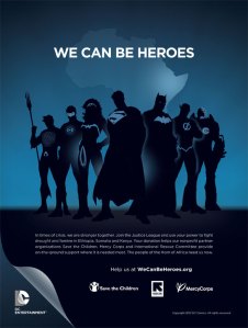
I came across this ad on twitter via @geekforever. (Disclaimer, my wife works at Save the Children and mentioned the DC/Save collaboration previously, but she didn't show me any examples of the ad work: A Collaboration between DC Comics and Save the Children

Here's a link to the obviously good cause  (I might buy one of the shirts or iPhone case).

As a comic book fan, I was really blown away by the artwork, it's beautiful and striking.

As a person who makes ads, I wondered, this is beautiful art, but it is a great ad?  Yes, it is attention getting which is important, it stands out, especially to someone familiar with the characters. That's important, and I think it works well enough here that the audience will want to pause long enough to engage the ad and learn more about the message.

But I can't help but feel it also is off-message. I couldn't put my finger on it at first, but as I thought about it, I realized the focus here is on the heroes, not on you -- the audience member turned hero.

So while the ad is beautiful and awesome does it reinforce the emotions and feelings that DC/Save want? Does it make the audience member feel like a hero, feel like someone who can save a life? I don't think so.

I read somewhere "design without a message is art, design with message is an ad.

So the ad gets the right kind of attention (interest), but it doesn't impute* it's message and emotional content, and in that sense, it's great art, but only an ok ad.

Addendum:

Thinking some more about the ad as I walked.... The problem really isn't the art, but the headline. "We can be Heroes." Of course the Justice League can be heroes, the point is "you" can be a hero.  It's not about joining the Justice League (the heroes in the artwork), but about you helping when they can't. So if it was the same artwork, but a headline like: "They can't be heroes, but you can..." or "Be a real Hero..." or "You don't need a costume to be a hero" then that reframes the message and the focus of the ad.

[*Impute: My new favorite word --  I picked up reading the Steve Jobs biography, which is pretty inspiring if you ask me. Basically a product or ad should impute to it's audience it's message -- essentially it's story and qualities should be obvious on an intuitive level, by the presentation. At least, that's how I took it.]

Be afraid... be very afraid.

I caught this ad yesterday by chance. At first I was intrigued, I thought the concept seemed neat and execution was well done. That was of course till I got to the end....

http://youtu.be/-STYRAbTteA

You could cue the foghorn sound in my head. Come on now.

Maybe they polled this message before running it, but it seems incredibly tone deaf and off-emotion:

"American creativity and innovation are under attack" (by who China) and "Foreign criminals" (who, terrorists, chinese hackers).  No! the threat is people downloading movies and music illegally, what wait?

It's big build up for such a... petty payoff. It feels way disingenuous, like a group of big executives came together and schemed, let's make it about America and American ingenuity, yeah, that's the ticket.  We'll scare people into supporting SOPA, they don't need to understand it (because if they did they'd probably be against it),  they're easy marks.

Now I'm worked up.

This ad is insulting actually, it's premise is that you can just scare folks into agreeing with you. To be honest it pisses me off, it's the worst kind of cynical advertising, and despite the nifty graphics and cool execution it's garbage.

Whatever the reasoning even if there is a more innocent rationale for the ad, I think it'll be incredibly ineffective. I just can't see this ad getting people worked up, it won't resonate because it so obviously trying to make a mountain out of mole-hill, why should anyone care? Because of "foreign criminals"? Do they really want me to believe that the greatest threat to American innovation is online piracy? How about our industrial age model school systems, maybe we ought to start, huh.

Think of the same basic message, but maybe you have a below the line worker, a grip or gaffer talking about how piracy costs them money out of their pocket (I've had that argument made to me before by a gaffer).  That kind of personal connection might work, because it helps to make this big issue of piracy (who's it really hurting, big movie studios) into something personal (it's hurting regular guys and gals like Joe Gaffer).

But unless you have Michael Bay up there talking about how he's leaving the movie business because he can't make money anymore because of internet piracy.... Ok, even then it probably wouldn't be believable.

All this hyperbole over online piracy, just misses the mark, either people don't see it as stealing or if they do, they see themselves as Robin Hoods, fighting the good fight against big corporations. My guess is that the best argument to make is to make it personal (show the victim) or reframe piracy as stealing (which they do in those movie previews) and appeal to people's better angels.  But this ad makes it all seem like an epic moral struggle of good v. evil, and it's just not that in most people's minds, sorry.

The only good news about this ad is the fact that it's so bad, it's a good bet that no one will want to illegally download it.


Hail to the chief

The president is up with his first ad. http://youtu.be/sq3GGwgV7R0

When my wife forwarded me this ad, she added the comment that it seemed odd for a first ad.  Watching it, I have to agree.  You expect the first ad of the President to be bigger, more grand, more sweeping. Instead this ad is a small response ad on energy independence (not exactly a burning issue these days) -- it feels more procedural rather than grand, more tactical than strategic.

Stepping back, I tried to think through the strategy behind leading with this ad.  My best guess is that this ad is setting up the message and themes of the campaign. Much in the same why a pitcher might setup his fastball by first throwing a change-up, I believe this ad is intended to prime the electorate.

1) The ad frames the race as Obama v. Billionaires. 

With super-pac spending out of control in the Republican primary, this ad is a shot across the bow, that Obama isn't going to take it lying down. It also frames the race for the electorate, who are you going to believe Obama or secretive oil billionaires who are "not tethered to the facts"?

It also dovetails nicely with the theme that Obama is on the side of the middle class, while Romney has secretive oil billionaires on his side.  Who's side do you want to be on in that fight?

2) Show that Obama is not just another politician.

It's not about ethic or energy independence per se, those are macguffins for the real message: That he's honest and he's accomplished things other than health care and fighting over  budgets.

3) He already is seen as flash, this ad shows some substance.

We've seen Obama talking eloquently to huge crowds, we've felt the passion and flash. This ad is about the substance, the hard work of governing.

This ad stands as a good example of the kind of trench level ad that's part of a larger ad campaign. It frames the story for independent voters, and injects itself into the narrative (responding to attacks against the president). On it's own it's pretty humdrum (and it feels like they cram one line too many into it), but as part of a larger more long term campaign it starts to make sense.

Form follows Emotion

I'm reading the Steve Jobs biography, and I came across this quote from his first designer, Hartmut Esslinger: "Form follows emotion."

The statement resonates with me particularly because I'm such a fan of form integrating with function, but of course in advertising function basically boils down to emotion.  The form should be connected intimately to the emotional frequency of the brand and message you're trying to drive.

That leads me to a discussion of this ad:

[youtube=http://www.youtube.com/watch?v=zet8ZGXmjj4&eurl=http%3A%2F%2Fwww.nationalreview.com%2Fcorner%2F287556%2Fnew-huntsman-tv-ad-country-first-brian-bolduc&feature=player_embedded]

This ad is surprisingly simple in form, but that simplicity is a strength in this case adding a verisimilitude to Huntsman.Using the debate clips without commentary is powerful, even the cutaways to Perry and Mitt looking flummoxed works and adds to the sense of reality.

Huntsman comes off as tough, honest, and eloquent. Talking about his kids in the navy serving a Democratic president is a nice touch.

While patriotism is a good quality in an of itself, it also serves as a macguffin -- what Huntsman is really saying is he's the principled one in the race. The contrast is obviously with Mitt, where Mitt is calculating and rising money, Huntsman is principled and committed to his values, even serving for a Democratic president because it was his duty. He's not playing politics he's serving his country, what more could you want in a President?

I think this is a very good ad for Huntsman, contrasting his strengths against his opponent's weaknesses. It's presents his best on-emotion argument for voting for him, in an authentic execution, the real question for him is this enough to propel his campaign forward? And, do Republicans care?

Whatever works...?

A quick post: Crossroads GPS is up with a new ad today attacking Elizabeth Warren who has moved to an early lead against incumbent Scott Brown. [youtube=http://youtu.be/78NZk1o8nr0]

I like the graphics and the look of this ad. I do find the V/O a little snarky especially the "Tell professor Warren...." at the end. In a vacuum, I think trying to muddy the waters on Warren's anti-wall street credentials is smart if dangerous play -- dangerous because I'm not sure you can get voter's to believe it, as it goes against the story they hold in their heads and the facts.

But that discussion is moot in the face of the real issue with this ad: it's totally intellectually dishonest.  Forget the facts for the moment, just a few weeks ago, they were attacking Warren for being the intellectual foundation of Occupy Wall Street, now they're saying she's in league with Wall Street? Just how dumb does Crossroads believe voters are?  I really find this approach insulting and an affront to political advertising. It's one thing to shift your message, as the winds of the electorate swirl, but this ad isn't a shift, it's a complete u-turn from what they were saying in their previous ad.

Crossroads obviously thinks they can manipulate voters into believing whatever they see on TV, and they're going to say anything to win, what ever works right? Wrong. It's a cynical ploy to play on voters anger, and it's just wrong and immoral. It's not the only reason Americans hate politics and politicians, but this is as good as reason as any.

And the Nominee is...

I was planning to just look at Rick Perry's new ad today, but then Newt went ahead and released his first spot of the primary season, so it's a twofer Monday here at Ad Nauseum. [youtube=http://www.youtube.com/watch?v=aiCRW5zGSG4&]

I really liked this ad from Perry which basically takes ownership of his much discussed brain fart. It felt pretty authentic, and I think Perry does a good job delivering the lines. There's not much else to the ad, the issue and positioning stuff is really just filler. I frankly can't remember any of it --  I'll always remember this as Perry's apology ad, even though that's only about half the ad. There's a point to be made here: That you can't cram too much into an ad, basically in :30 people will remember one or two elements. If you want them to remember more, then you can have one overarching theme, and the other elements need to connect to them, but even then, it's the overarching theme that resonates with an audience.

The delivery is smooth, and not too forced, though I wouldn't go so far to say natural. Still, I think Perry comes off as likable, and this ad could only help remind folks why they were so excited about Perry to begin with. My biggest question about the ad is the timing. I think this ad comes too late to really stem the damage from the debate. An ad like this a couple days after the debate mistake or possibly a week afterwards might have muted the criticism, and showed Perry as a likable guy who could good naturally admit mistakes.  Coming almost three weeks after the gaffe, I really wonder if audiences have moved on.

[youtube=http://www.youtube.com/watch?feature=player_embedded&v=brdrjLavTzU]

In the first 10-15 seconds of Newt's first ad, I thought I was really going to like it. It's exactly the kind of message I think a Republican should be using (talking about American exceptionalism in nostalgic and reverential tones). But after those first 15 seconds, the spot doesn't really go anywhere except to Newt.

I can't quite put my finger on why it's so flat. I really like the images (the Marines marching, the hand on the amber waves of grain, the flags), so I don't think it's the visuals (except the weird cross fade from the Statue of Liberty).  I wonder if it's the music which starts as emotional, but never builds or goes anywhere. Much like the spot, the music seems to meander, once it's made it's central point. The spot seems almost tamped down. I wonder if that was a deliberate choice?

Maybe they're trying to play Newt against type, he's known as being fiery, so we'll play him calm and mellow. I'm not sure that really works here, even though I think the message is appealing to voters.

At the end of the day, I think voters will respond to this ad, it's compelling enough, but just so.


Is it what you say or how you say it?

[youtube=http://www.youtube.com/watch?v=kE_wj6NHdEQ] I watched this ad yesterday, the latest salvo in the Massachusetts senate race, and I knew I wanted to comment about it.  Watching it again today, it's amazing how much I forgot about it, ok I'll get to that later.

What I responded to in this ad was the message, Warren is unapologetically saying she's a crusader against Wall Street, and she's going to fight for the 99%.  What's interesting is that she does it (unlike me) deliberately without invoking the language of the Occupy Wall Street movement. Of course, you all remember Crossroads GPS just attacked her for her liberal extremism as the intellectual underpinnings of that protest movement.

What I think Warren does successfully here is embrace the message without embracing the messenger.  She doesn't run from who she is or her record, she doesn't defend herself "before you hear a bunch of ridiculous attack ads" (which of course have already started), but rather issues a forceful statement of principles and values.

Alright, that's 130 or so words in praise of this ad. When I first started this blog, I broke my reviews up into a form grade and a function grade, while I found that format too constraining and not ultimately helpful, I think it's instructive here.  The function of this ad would be an A-, the form, on the other hand, being generous would be a C.

What I remember from the ad was the message: Warren fights Wall Street, which is a pretty good summation, but loses all of the detail and texture of the message. I loved the archival pictures, so vivid, but the text is kind of flat and at times falls into political cliche. The taking on the powerful interests message was lost on me until I re-watched the ad, her story had drifted away.

For a candidate who has capture so much support and excitement of voters, her delivery is alright, but not especially compelling. Was a scripted ad read off a teleprompter the best way to go here? I've never heard her speak, but I can't help but think an interview ad going over the same message points, but spoken spontaneously would capture more of the real Warren. Here, I feel like I'm watching a candidate speak, the ad is well executed for what it is, but it's not compelling in the least.

Warren wants to tell us who she is, but I feel watching this ad that she's hiding behind a teleprompter and words written by a political consultant. I want more from her than this ad gives.

Again, maybe that's not fair, maybe she stinks in an interview, but what the ad gives in message is lost in authenticity. (Don't get me wrong, it's not that I don't believe Warren, I just don't connect to her.)

If you averaged my earlier form grade C with the function grade A-, you end up about a B, and that's where I'd put the ad, B/B-. It's not a bad opening ad, certainly serviceable, but this blog isn't about serviceable ads.  I've only really read about Warren in the book "Confidence Men," by Ron Suskind, but she comes off as a compelling and intriguing figure there.  I can understand the excitement about her campaign, because I felt it too just from the little she's in the book, she seemed genuine and passionate.

I don't get that feeling here, or maybe I do, but it's diluted.  Am I less excited about Warren now, no, but I'm a believer after all, am I more excited, not really. At the end of the day, this isn't a bad ad, it's right where it needs to be message wise, but I just felt the pieces were there for a great ad.

Battleground Massachusetts

Came across this ad running against Elizabeth Warren in Massachusetts by Crossroads GPS, and while I'm not sure I have a lot to say about it, I wanted to comment on it anyway. [youtube=http://www.youtube.com/watch?v=tNxez4ddpa0&wpisrc=nl_fix]

Execution wise, there is nothing particularly interesting about the ad.  What attracted me to it was the message.

Step 1: State the problem -- no jobs, ok, I'm with you so far...

Step 2: Attack Elizabeth Warren for not focusing on jobs..., and siding with Occupy Wall Street.

Maybe they have some polling that shows this to be a good strategy.  I've said before Massachusetts is more blue collar Democrat than lefty liberal Democrat. But I see reveal problems with the approach:

First Warren isn't even in elected office, so hitting her on jobs seems problematic at best, and at worse, it raises the issue for Senator Scott Brown, who has just voted against fairly popular job's bill.

Second, the shots of Occupy Wall Street are so fast, you really don't see the "drug use" and the attacking police shot, looks like police are attacking the protestors (on top of the stories of police abuse of protestors that have become youtube hits). Again it looks like you're undermining your own cause there.

Third, the heavy handed language feels like something out of the 60's not the 10's. "We need jobs, not intellectual theories and radical protests," wow, hell I would even agree with that, but what the heck does it mean?  Put another way, who is this add aimed at? To my ear it's aimed at Tea Party members trying to shore up the base, but I wonder would they ever vote for Warren.

So if the ad is more likely aimed at middle class/blue collar independents, who typically vote Democrat, but swung to Brown last election, then I think it's mis-calibrated. The language is too harsh and steeped in conservative lexicon (intellectual theories, radical protests, extreme left protests), it's like their so inside their own bubble, they can't put themselves inside some else's head.

I may be wrong, but I think most independents see Occupy Wall Street somewhat favorably, even if they're unsure about them. This ad leaves no place for them to go, pushing the extreme liberal angle so hard, that I can't help but feel like folks would reject it out of hand.

If this is the attack they want to make, I think a softer touch would be more effective:  Link Warren to Occupy Wall Street and hint at their extreme nature (maybe mention the name with visuals of the protestors acting up), and let folks fill in the blank.  Maybe the best description of this ad is tone deaf. If this is how Crossroads GPS is going to spend it's mountain of cash this election season, Democrats can breath a sigh of relief.

[Post-Script] The other problem with this ad it's way to easy to deflect the attack. In this case, done particularly eloquently by David Donnelly, the director of the watchdog group Campaign Money Watch, “This is an ad by the one percent, for the one percent."

Also worth a read is Greg Sargent's post which debunks the truthfulness of the ad and specifically the Schoen Poll cited in the ad.


So it's been a while

Yes it has. Sorry for the long absence, as usual with the absences this one was due to not really having anything to write about. That's not the same as not seeing a lot of ads, there have been some, including the Rick Perry ad that looks like the Tim Pawlenty ads, that looks like "Armageddon." No, I just felt like I didn't have anything new to say. Today, I'm not sure if I'm adding to the conversation or not, but it's time to get back on the wagon with this ad from the League of Conservation voters: [youtube=http://www.youtube.com/watch?v=WE0S5CWHHcY&feature=player_embedded]

Why did I chose this ad? I actually think it's clever in the way it takes on Scott Brown's hometown boy done good image, inverting everything from his barn jacket to his pickup truck.  I especially like the first scene where the barn jacket comes off and he's wearing the power suit underneath that's a nice touch.

I also like the oil smear graphics, even though I think they're prettied than they are effective. Frankly, the only CG that sunk in the first time I watched it was the last one, that he got a 0% from the League on his voting record. It makes me wonder if they even needed the first two CG's at all.

Here's what's interesting about this ad, and who I wanted to write about it: while I like the elements of it, I'm not sure how effective an ad it is overall. Somehow the pieces don't all add up, not sure whether it's the tone or the execution, but it feels political rather than organic -- like somehow you can see the puppet master, instead of watching the puppets.

Still, I think this is the right approach to take with Brown, go after his man of the people persona, try to take out his strength, and put him on the defensive. If the public sees him as another politician or a Republican (though Massachusetts isn't as liberal as most people believe), then it takes out the rationale for his candidacy.

It's a tough position, to be running against Washington, when you're in Washington. More about that tomorrow.


Cats and Dogs, Coke and Pepsi

I know I've said it before, but I love it when consumer brands go negative. First, it serves as an important signal to people who claim only political ads play in the mud and bemoan negative ads, that negative ads are all around us. Secondly, it's usually an interesting to see the approach that consumer brands take as they go after each other -- often to less effect than negative political ads. Here are two ads for Pepsi going directly after Coke:

http://www.youtube.com/watch?v=if_V648W00k

http://www.youtube.com/watch?v=J8jmSdO20_s&feature=relmfu

What I find interesting about the approach of these ads is that they aren't taking on Coke on the "issues" or the "facts." There is no price comparison or taste comparison here, these ads are making a purely emotional appeal.  "Summer time is pepsi time."

I just started reading a promising book, "Storytelling: Branding in Practice," and the author makes the following point, which puts the Pepsi approach into an eye opening context:

"The brand story gradually becomes synonymous with how we define ourselves as individuals and the products become the symbols that we use to tell the story our ourselves." 

These pepsi ads are trying to tell a story about the brand that is Pepsi.

Pepsi = fun, partying, summer, hip. If you identify with those qualities or want to identify with those qualities, then you ought to be drinking Pepsi, just like Santa and our friend the polar bear. Pepsi goes after Coke by directly trying to redefine their own symbols (Santa and the polar bear), by showing them crossing the line for Pepsi it makes it ok for "you" to cross that line too, it also suggests that coke is on the other side of the hip/fun/cool line.

What does Summer represent? A break from school or responsibilities, a time to let lose, have an adventure, to live life. If you want to embody those qualities drink Pepsi,  or maybe more poignantly if you think you're a fun, hip, cool person and want others to see you that way, you better be drinking Pepsi.

While I appreciate the jab at Coke in this way, and I'm sure it has created a lot of buzz, I'm not sure if it's an effective attack. Much like the McCain "Celebrity Ad" reinforced Obama's message as it sought to undermine it, and was ultimately ineffective for that reason, these ads seek to subvert the strength of it's opponent, but I think it actually reinforces it. Sure Santa and the Polar Bear switch to Pepsi, but we all know they belong to Coke, and frankly the execution of the ads, doesn't really make me (though maybe the younger viewers it was intended to reach have a different reaction) believe the switch. It feels all too forced and contrived.

What's wrong with this spot?

http://www.youtube.com/watch?feature=player_embedded&v=xr4LPYQHfFM&wpisrc=nl_fix Dick Lugar is up with his new ad, trying to reach out to a party base that may have passed him by.

If they had come to me first and asked me what I thought, here's how the conversation might have played out:

Me: "I like the last line, 'a veteran fighting along side our new recruits, will help them....' Do we need the 'I'll hope you agree before it?"

Them: "Well, [insert person's name here, senator, staff, pollster, wife, donor] insisted that it be in there, makes him seem like a regular guy, you know?:

Me: "Ok, well it sounds kinda weak, when we want him to sound strong. Isn't that the point of the spot? That's he's taken on this problems before, that's he been toughened by age and experience? Now, why no music? It's an interesting choice."

Them: "Yeah, well we didn't want to make it seem like a political commercial."

Me: "Oh, you have a senator speaking directly to camera, but you didn't want it to feel like a political commercial? Right now it feels really flat, music could help give an emotional frame to the spot."

Them: "We didn't want to seem like were trying too hard or being manipulative?"

Me: "Ok, well, to be honest the spot feels a little desperate right now, like Lugar is begging for support, it feels a little pandery [is that a word, pandering?]. And, well, what the word, the Senator, well, he comes off as kinda old looking. That's what struck me the first time he's on screen."

Them: "Really? We had a special make-up artist who works with aging rock stars." [That's a true story, I used a make-up woman who's specialty was aging rock stars, she used a spray gun to paint on the make up of an aging man running for office.]

Me: "Well he looks and sounds old, and he's a little weirdly happy, when he should be more intense or something, again music would help...."

Them (looking increasingly like they want to leave): "Yeah. What else?"

Me: "What's up with the Reagan shots."

Them: "Conservatives love Reagan, Lugar worked with Reagan, therefore conservatives love Lugar. Get it?"

Me: "Yeah, well, the shots look dated, and make you realize that Lugar has been in office a long time. Who told him to smile the whole time? <Sigh>"

Them: "So basically, you think it's emotionally flat, he smiles too much, looks old, and seems like he's pandering?"

Me: "Exactly, and I just don't buy it, feels like he's trying to be something he's not comfortable with."

Them: "And that..."

Me: "Is that new, did I not say that before?"

Them: "No..."

Me: "Oh, ok, yeah it feels inauthentic too. Alright well, good first cut, let's get back into the edit room and fix it."

Well, it would have went something like that.

Playing with and against your story

A couple of ads from the Republican primaries. Ron Paul is up first, with a very stylistic ad heralding the coming of a new asteroid er, I mean a debt ceiling compromise.

[youtube=http://www.youtube.com/watch?v=UUNIeOB0whI&feature=player_embedded]

To my mind, Paul's story is staunch conservative, who holds views outside the mainstream, but doesn't let that stop him. This ad plays along with that story, reinforcing what might be his strongest defining characteristic, that he's true blue (or red), so to speak. He has principles where others lack it, he has conviction when others want to compromise.

I think this is a strong ad towards those ends. First of all, I love fake movie previews -- even if this one is more of a MacGuffin, it works a the open.  It makes Paul appear strong and presidential without drifting into the crazy and dogmatic realm, that's a tough balancing act. The shots at the ends are stills, yet they're not static, they feel dynamic and powerful, he appears presidential, which is important to his candidacy -- he can't just be a wingnut, people have to see him as a potential president.

I think this ad also does a good job of raising the stakes on the debt limit, turning it into a battle between the forces of conviction and the forces of accommodation and appeasement -- he turns compromise into an abdication of values. I really like the paper look they created, and I find it effective though I'm not sure why. This ad is a great example of the form of the ad (the stylistic elements, the music, the graphics) helping to drive the function (the message). Compare this ad to those early Pawlenty ads, they have a similar style, but in the Pawlenty ads it was all about style, there was no substance underneath.

Great opening ad that sets the frame for the Paul campaign.

[youtube=http://youtu.be/X0J1EhOKvtI]

On the other side of the coin is this ad from Michelle Bachmann. Bachmann's story of course is similar to Paul's except maybe throw in crazy.  I'm not as wild about this ad as the Paul ad, but I still think it might be an effective ad. This ad is short on style, but it's function is clear, to counter the image of Bachmann as a raving lunatic unfit to be president. So, she talks very calmly if artificially about her record (a record that would appeal to Republican primary voters) and comes off as a little charming (hard to see the charm because her "performance" feels forced, but I'm giving her the benefit of the doubt) and somewhat boring.

I also question the opening shot, the time-lapse of Waterloo -- not really compelling (maybe to folks in Waterloo), but later in the ad she has those nice archival pictures, why not throw some in of her own childhood?

I would also wonder if Bachmann can continue to run away from her narrative. While this ad does cast her as "serious" I wonder she can continue along this path, even as she bumps into her story -- it just doesn't feel authentic. Compare it to the Paul ad where he weaves what we know or might think about him into his message, and turns what might be a weakness into a strength. You can try to change your story, but it's not easy, and you have to maintain the consistency so people really believe what you're telling them.

Is it 2012 already?

I reviewed the Crossroads GPS ad earlier this week, as you may remember they're up with a $20 million buy.  Despite spending $20 million to run the ad, I found their ad cold, trying to make a rational case rather than wrapping an emotional case around some facts. I came across this online video made by the Romney folks that takes on the jobs/economy theme much more effectively than crossroads.

[youtube=http://www.youtube.com/watch?v=-44o5Dn6V98&feature=player_embedded]

Similar to the Crossroads ad, this one uses the President's words and turns them against him. But where the Crossroads' quotes felt out of context these feel devastatingly on point. While the CG's with the numbers feel a little complicated, and I found hard to read, I did like the driving drum music, and the final shot of the empty factory was pretty powerful. Glad this ad is on the internet only and doesn't have $20 million behind it.

Priorities USA responded to the Crossroads ad with this ad:

[youtube=http://www.youtube.com/watch?v=HY1l9OOxtqo&feature=player_embedded]

This spot is better than the Crossroads' ad, while it didn't break any new ground, and the portraits were neither particularly interesting (except for the kid at the end with the flag sitting on the soccer ball -- I think it's the ball that makes it feel authentic) nor innovative, they were trying to make the ad emotional. Gosh I do hate the ad in the TV effect showing your opponent's attack ad, it so clunky, can't we come up with something new? I did like the end line, "We can't rebuild America if we tear down the middle class."

Did I love this ad, no. It felt hackneyed and I would have rather seen more unoriginal portraits over the "ads blaming President Obama" section along with Rove headline rather than the ugly TV, it seemed to break the flow of the faces for me, and made the ad more political, and less about these people. At least they tried to hit the right emotional tone and tie it to the message, something the Crossroad ad failed to do.

These three ads/videos represent the opening salvo of the 2012 General election. Republicans want to make the election about Obama versus some hypothetical candidate, if they succeed then they win. Democrats want the election to be about Obama versus Romney or Pawlenty or Bachman or whomever, he wins that battle because they can't compare (and their positions are ultimately unpopular). Of the three, the Romney video did the best job on striking that resonate chord. I still question if folks blame Obama for the economy or lack of jobs, they may be angry about it, but not sure they hold him accountable, voters have already made a decision about Obama, and worked the economy into that calculus.

If Republicans have any chance, they're going to need more videos like Romney's.

Bang for your buck

Crossroads GPS is up with a new ad attacking Obama on the economy.  $20 million dollars a year and a half before the elections is a lot of money to spend.  So I figured their ad would be worth a look: [youtube=http://www.youtube.com/watch?v=OvnAE8olUxU&feature=player_embedded]

Wow. $20 million dollars and you get an ad that starts "These are the facts..." that was the line of the first ad I had to write all by myself (actually it went "The facts" just to be historically accurate) and that was 11 years ago.

I find this ad less than compelling.  In some ways it misses what's a trademark of of most conservative advertising -- emotion. There's no vitriol here, no anger, well, no nothing... Even the facts are kinda boring, and while they try to contrast "the facts" with Obama's statements, not sure the juxtaposition works.

Now I have a friend, who's opinion I respect, who thinks it doesn't matter how good or bad the ad is. His reasoning is $20m is a lot of money focusing people on Obama and the dismal economy, and I think he has a point..., but still come on, was this really the best they could do?

I guess if you hate Obama already this'll get you more angry, but if you're on the fence, is this going to do anything? I don't think so.... People already know they economy stinks, and they've put it into their Obama calculation.  Is this ad about the debt ceiling vote? I'm not sure, but this ad just feels kinda mushy to me, it may be on-message, but it's not on-emotion. It doesn't really make me angry, it doesn't push any emotional hot buttons or at least doesn't push them in an effective way (I suppose the Obama "shovel ready" line is supposed to make him seem out of touch, but it feels oddly out of context the way it's presented here).

$20 million is a lot to spend, but to me this is just another example of spending a lot of money to air something, when they should spend more than $12k to produce the ad.